Case overview
Deb hired us to create an online presence for her counselling services.
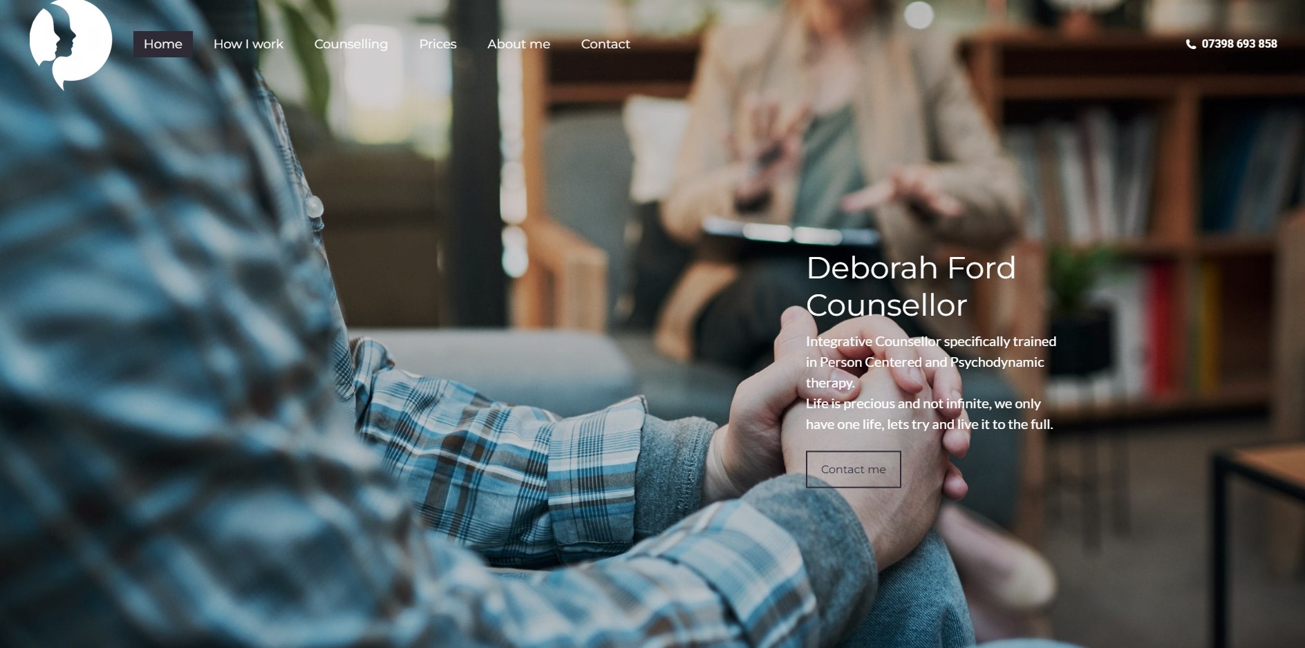
Designing a website for a counselling practice requires a very different mindset to most commercial projects. The priority isn’t persuasion, it’s trust.
From the outset, our focus was on creating a calm, reassuring experience that would help visitors feel safe, understood, and comfortable enough to take that first step.
The Brief
Objective
Create a trust-first counselling website designed to:
Encourage contact enquiries
Reduce anxiety about starting therapy
Communicate safety, empathy, and professionalism
Core Positioning
“A safe, confidential space to explore your thoughts, feelings, and experiences.”
Key angles:
Warm, human, non-clinical
Experienced across complex life issues
Flexible ways to access therapy
Works with adults, children, and young people
Our Approach
Designing a website for a counselling practice requires a very different mindset to most commercial projects. The priority isn’t persuasion — it’s trust.
From the outset, our focus was on creating a calm, reassuring experience that would help visitors feel safe, understood, and comfortable enough to take that first step.
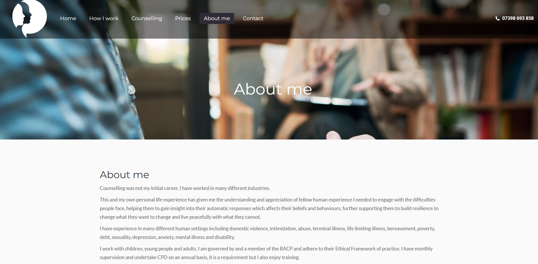
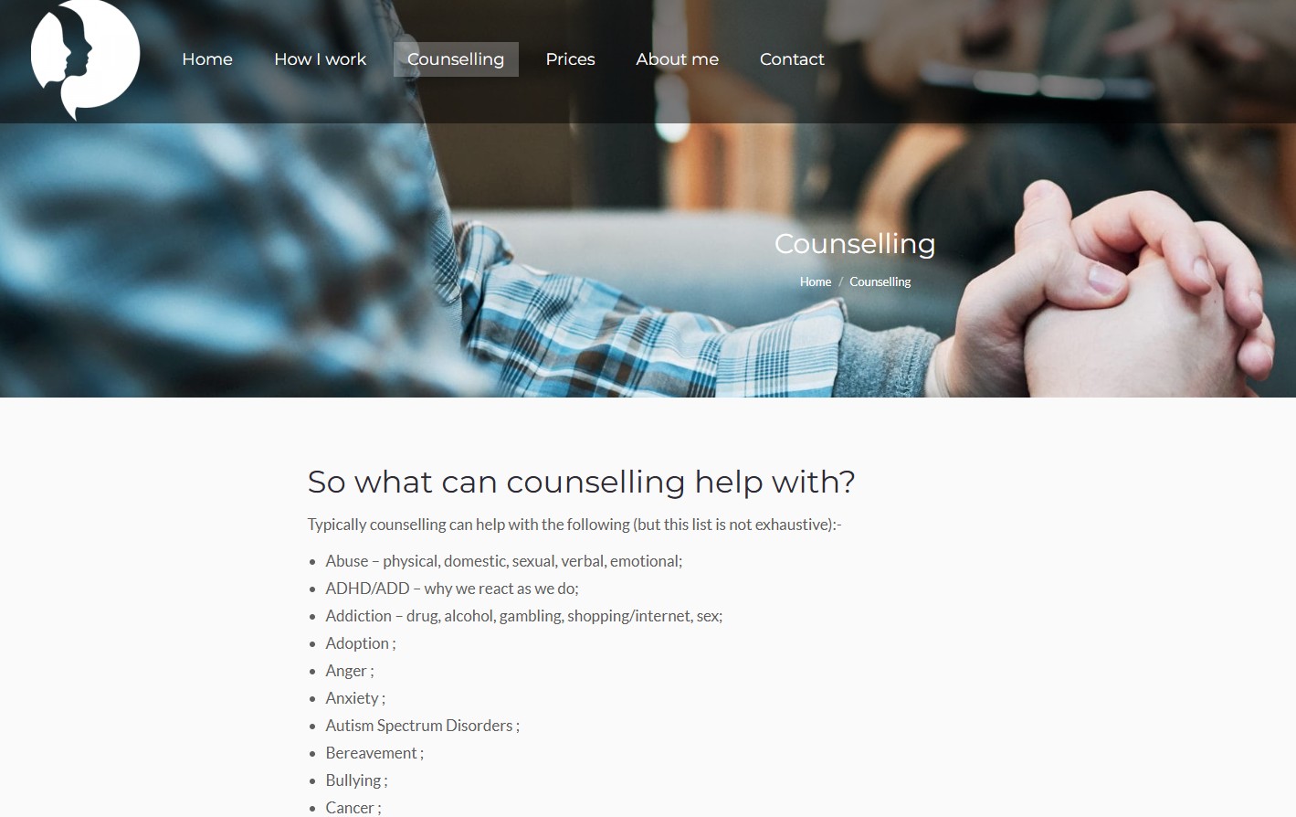
We began by simplifying the structure of the site. Rather than overwhelming users with too much information, we carefully organised the content into clear, accessible sections — allowing visitors to quickly understand who Deb works with, how she works, and how to get in touch.
Tone of voice was a key consideration throughout. We worked to remove any language that felt overly clinical or impersonal, replacing it with wording that feels human, supportive, and easy to relate to. The goal was to reflect the experience of counselling itself — gentle, non-judgemental, and at the visitor’s pace.
Visually, we leaned into a clean and minimal design. Soft spacing, neutral colours, and simple layouts help reduce cognitive load and create a sense of calm. This ensures the content can be absorbed without distraction, particularly for visitors who may already be feeling overwhelmed.
We also paid close attention to the enquiry journey. Clear calls-to-action are placed throughout the site, but in a way that feels inviting rather than pushy — recognising that reaching out for counselling is a significant and often emotional step.
Finally, the site was built to be fully responsive and easy to manage, ensuring it continues to support the business as it grows.
The Results
The end result is a website that doesn’t just present information, but creates the right environment — one that supports, reassures, and gently encourages visitors to make contact when they’re ready.
I asked Buxton Website Design to produce a website for me and was not disappointed with the results. Rich is extremely helpful and guided me through the process, I know nothing about web design but he explained what I should be considering, what content should be included. It took all the stress of producing a site away. The price was excellent and I am really pleased with the results. I would have no hesitation in recommending Rich or using the services again myself.